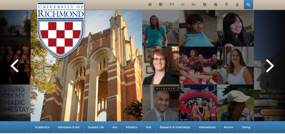
Returning students and faculty who navigated to University of Richmond’s website last week were in for a surprise.
The completely redesigned website, at www.richmond.edu, was released Tuesday, Aug. 18, 2014. The redesign had been in the works for a while, said the collective design team, which includes employees from University Communications and Web Services.
The website hadn’t been updated in about three years and needed a number of technological advances, said Phillip Gravely, director of web and editorial strategy. “Three years is the shelf life of an internet page,” he said. “We wanted to freshen the look because the web moves at such a pace that there are always new technologies to evolve with.”
Intensive research and the desire to create a website more adaptable to mobile devices also contributed to the redesign push, Gravely said.
“The rise has gone up really fast. Traffic from iPhones and Androids was small three years ago and now it’s a sizeable chunk,” Eric Palmer, director of web services, said. As a result, a large portion of the redesign was focused on making the website more accessible on a mobile phone.
The website is now responsive, which means the content and pictures you see on the screen will shrink or expand depending on the size of the web page and the device used. “This makes the website easier to use on a mobile device,” Joedy Felts, user interface manager, said.
Apart from making the site more mobile friendly, the design team hopes to expand content and display a sense of place with the new website.
The team has added a number of new visuals to the website including more info graphics, scroll techniques and photograph panels. “We’re going to use these to tell stories of what’s going on here and let the stories tell the experiences of our students, faculty, staff, alumni and community members … and this is the best way we can hold a mirror up to the university,” Gravely said.
These new visuals have added a different dimension to the website and feedback has been overwhelmingly positive, Palmer said. “Some people don’t like new things, but it has been surprisingly quiet on the negative front.”
Change is probably the biggest issue for most students, especially those in their final year at Richmond.
“Once I get used to it, I’ll like it,” Mollie Reese, Westhampton College '15, said. “It’s just confusing to begin with.”
Other students were excited about the website’s change in appearance.
Enjoy what you're reading?
Signup for our newsletter
“It’s much easier on the eyes and more organized,” Dina Staurulakis, WC '17, said.
While the main page of the website has already changed, over 130 plus webpages that link with www.richmond.edu will be transformed over the next year or so. “It’s a long process, as we are unique in that we manage everything centrally here,” Gravely said.
Because of the slow transition, there will be many changes to look for over the next year.
“We welcome feedback, both positive and negative, because ultimately our goal is to make the experience as smooth as possible for the students,” Palmer said.
Contact Collegian reporter Juliana Sorrentino at juliana.sorrentino@richmond.edu
Support independent student media
You can make a tax-deductible donation by clicking the button below, which takes you to our secure PayPal account. The page is set up to receive contributions in whatever amount you designate. We look forward to using the money we raise to further our mission of providing honest and accurate information to students, faculty, staff, alumni and others in the general public.
Donate Now


